
“Gave @tornnstudio a brief and she nailed it🔥”
Mom Store rebrand
This was such an exciting branding project to work on since I am already a customer and have been following along Anna’s journey since starting Mom Store in 2021 when I had my little boy.
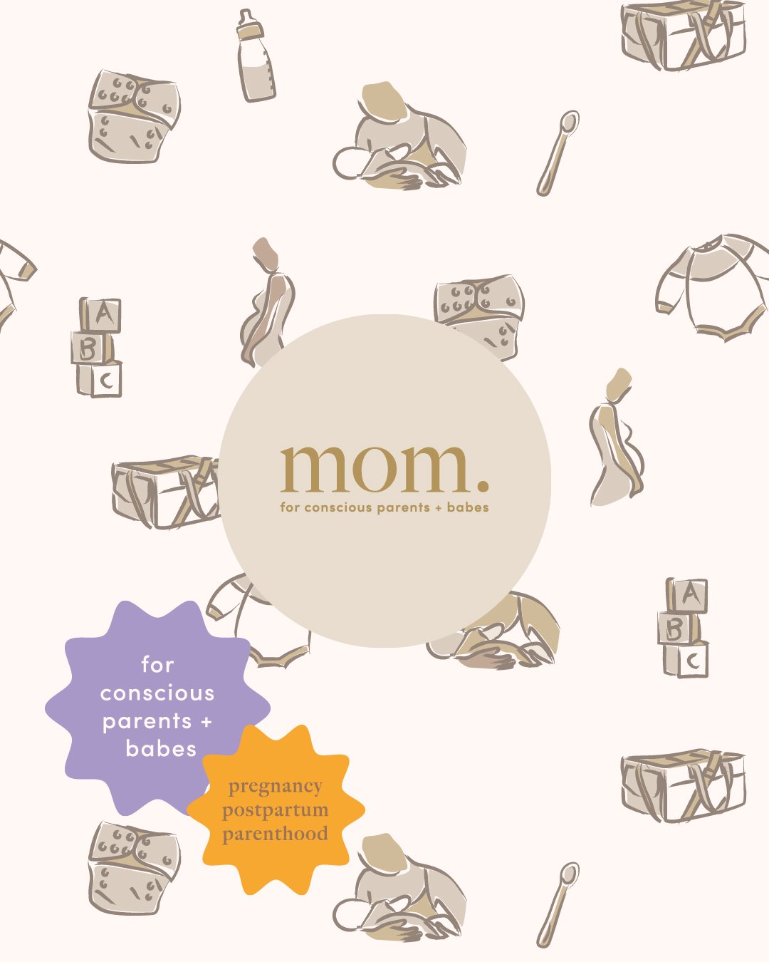
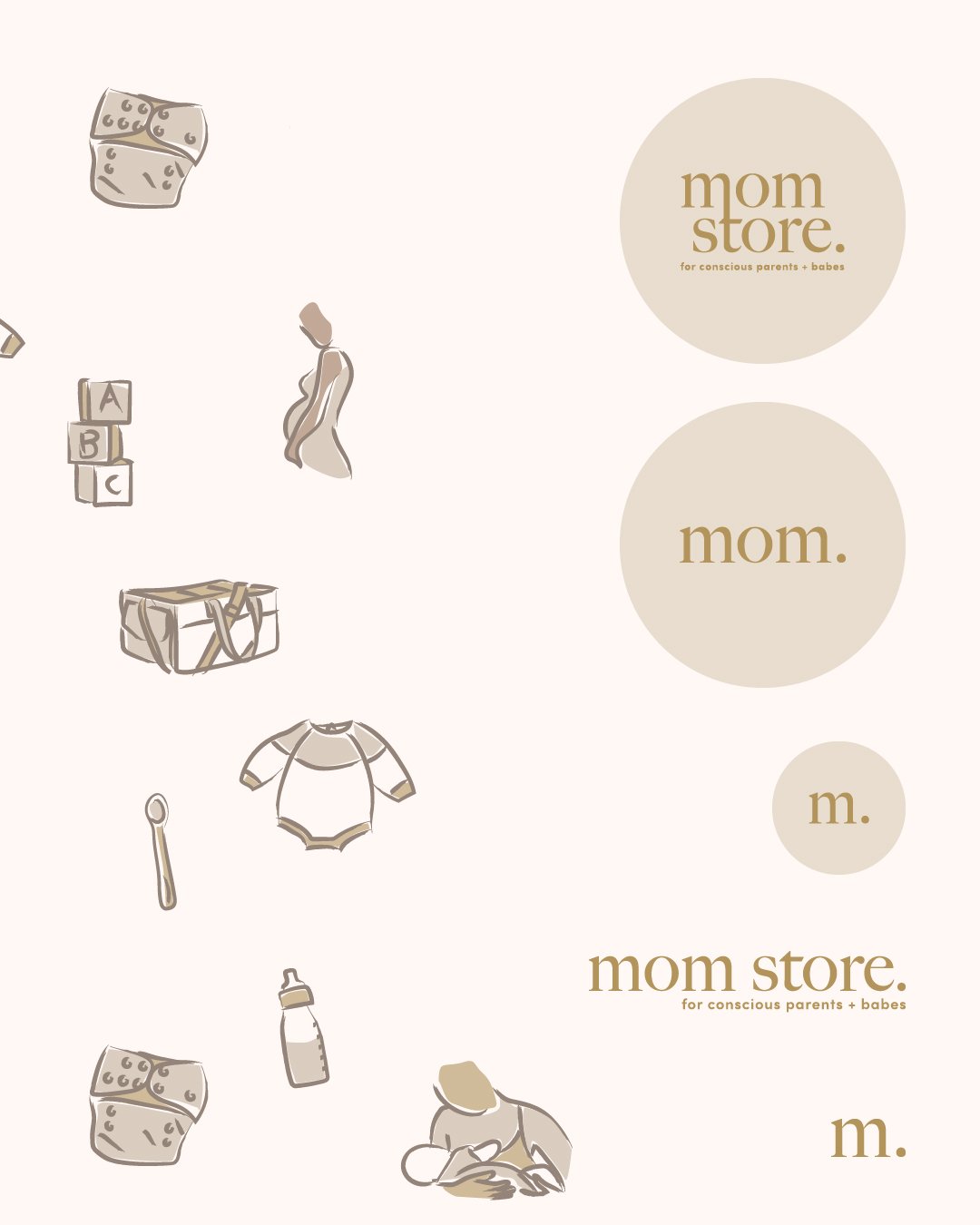
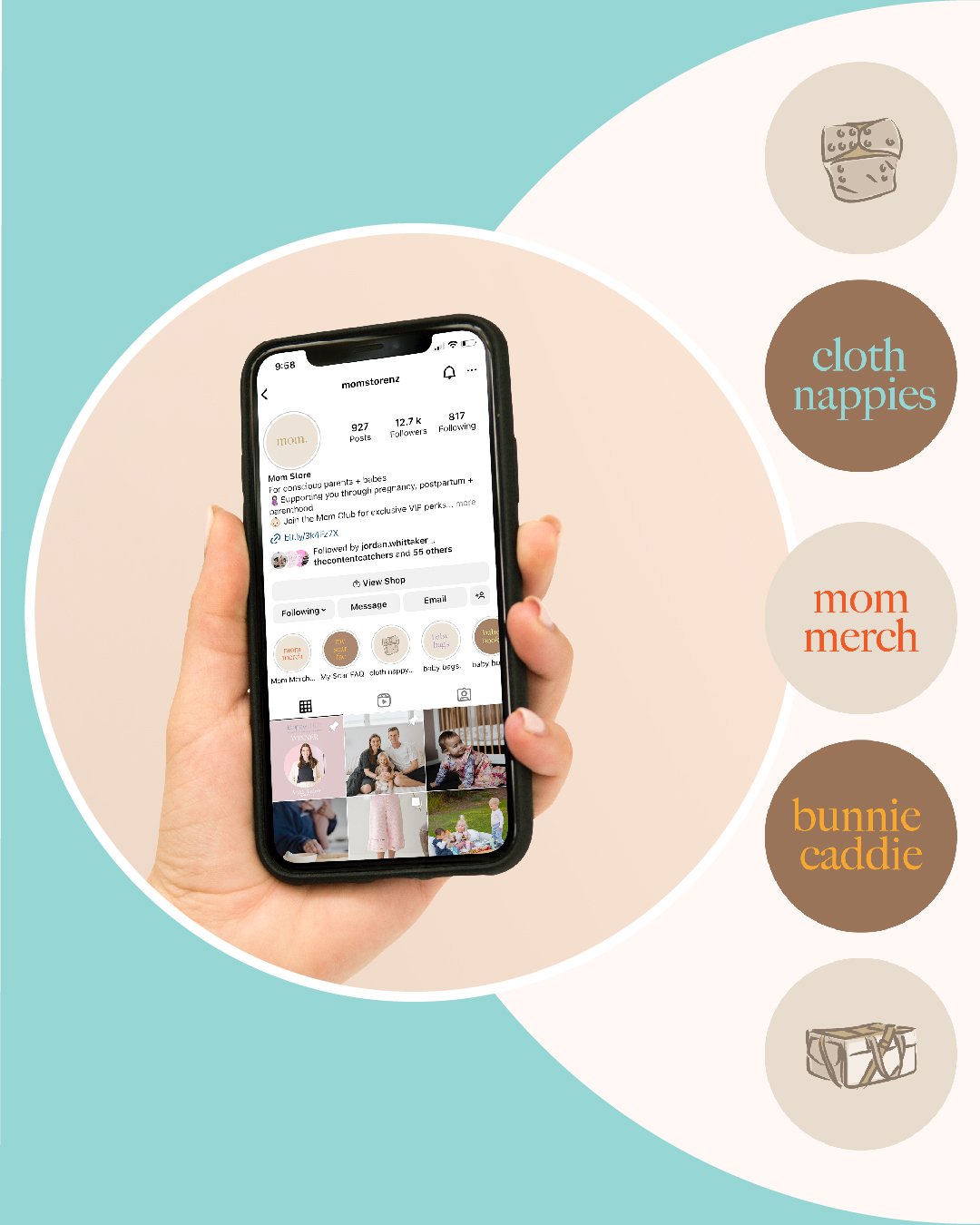
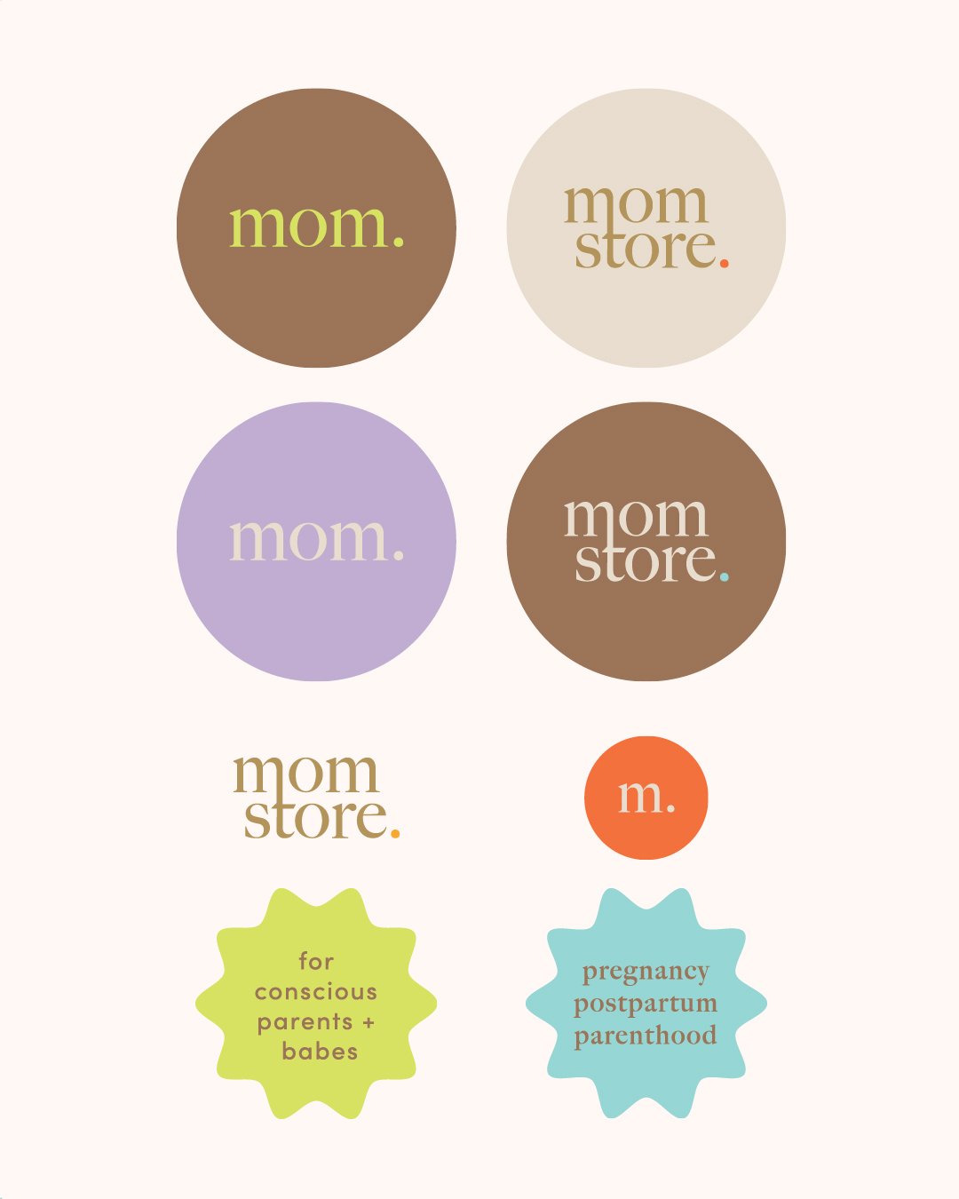
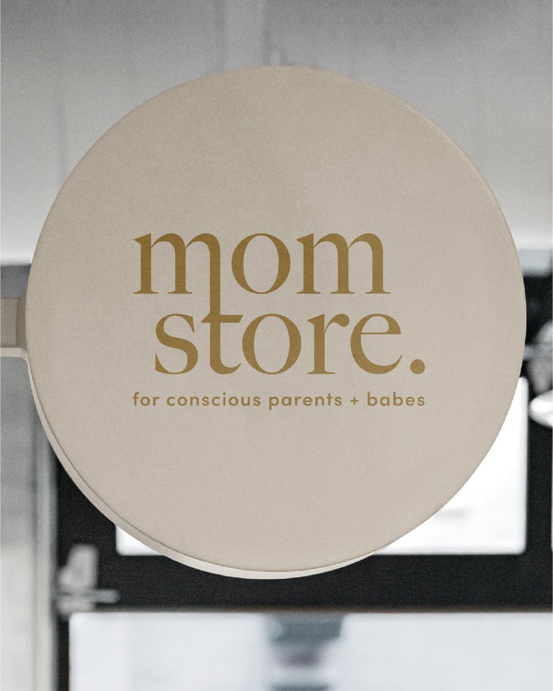
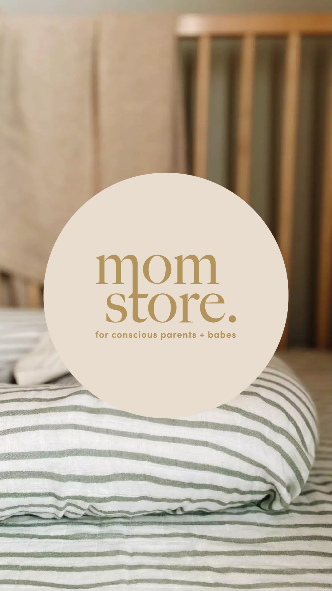
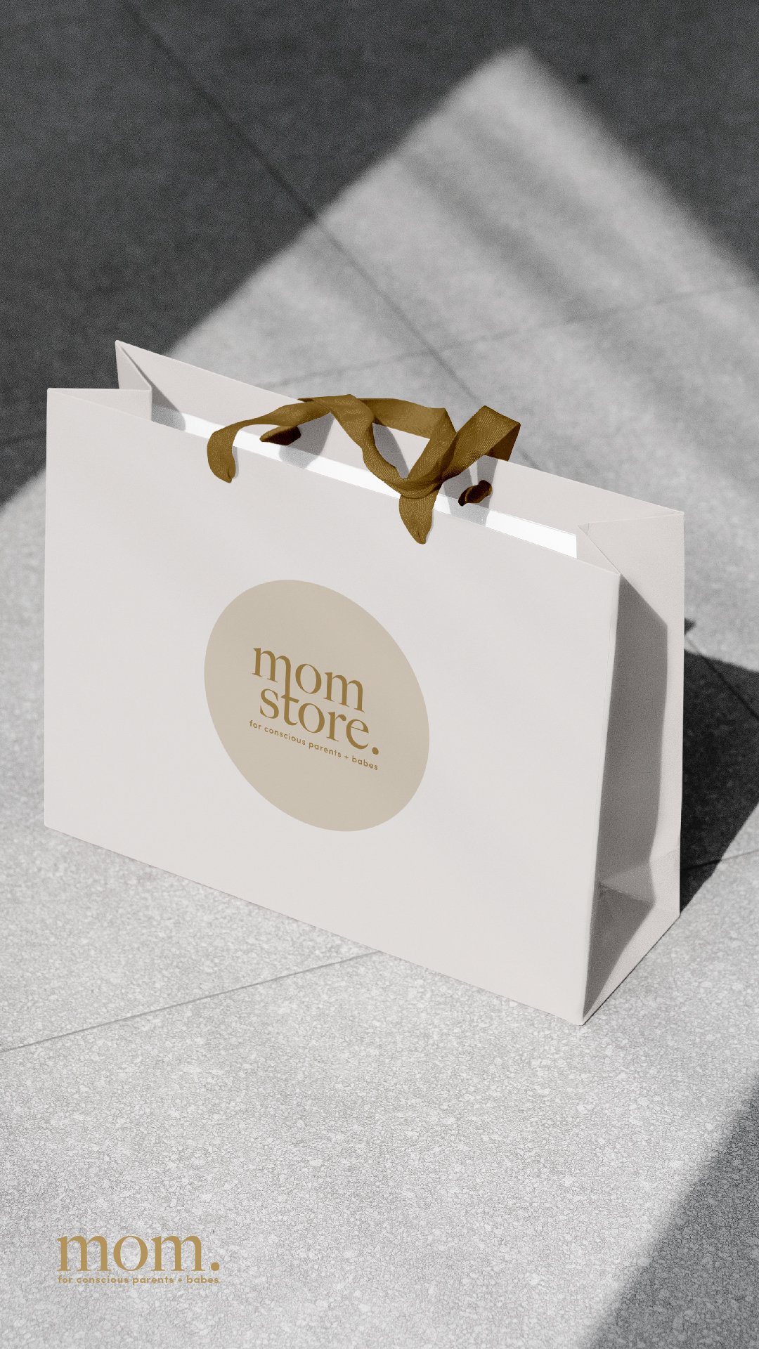
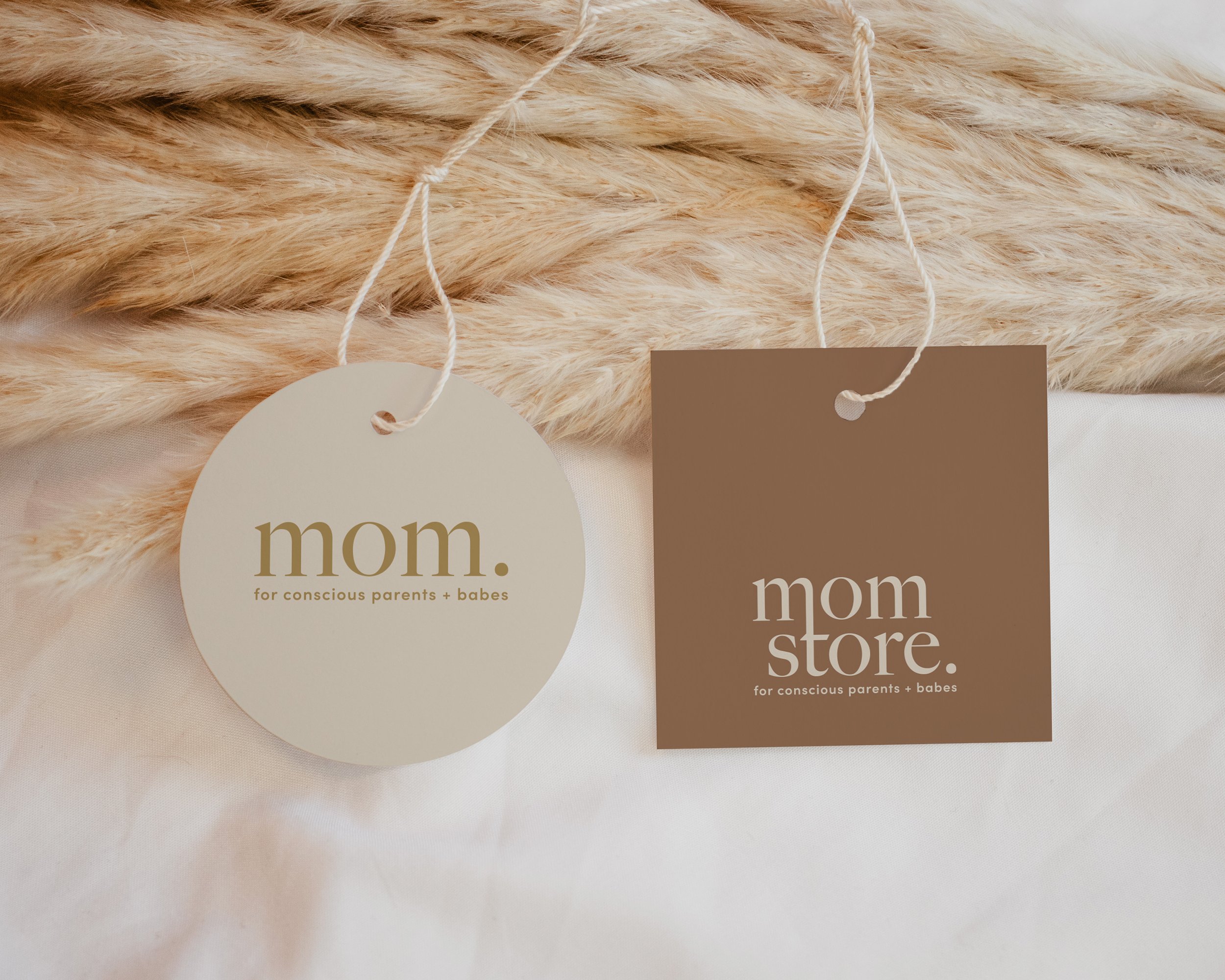
We started with the existing logo (mom), neutral colours and taglines. Not wanting to drastically change the brand but rather to extend to a full brand experience. Updating the main typography to reflect the modern yet playful nature of brand. This was a very similar typeface with small elegant details which reflect the high quailty and thoughtful nature of Mom Store. The addition of a mom store logo was very much needed as a physical store was on the way and it gives options to which is best suited to different applications. eg. merch vs the store.
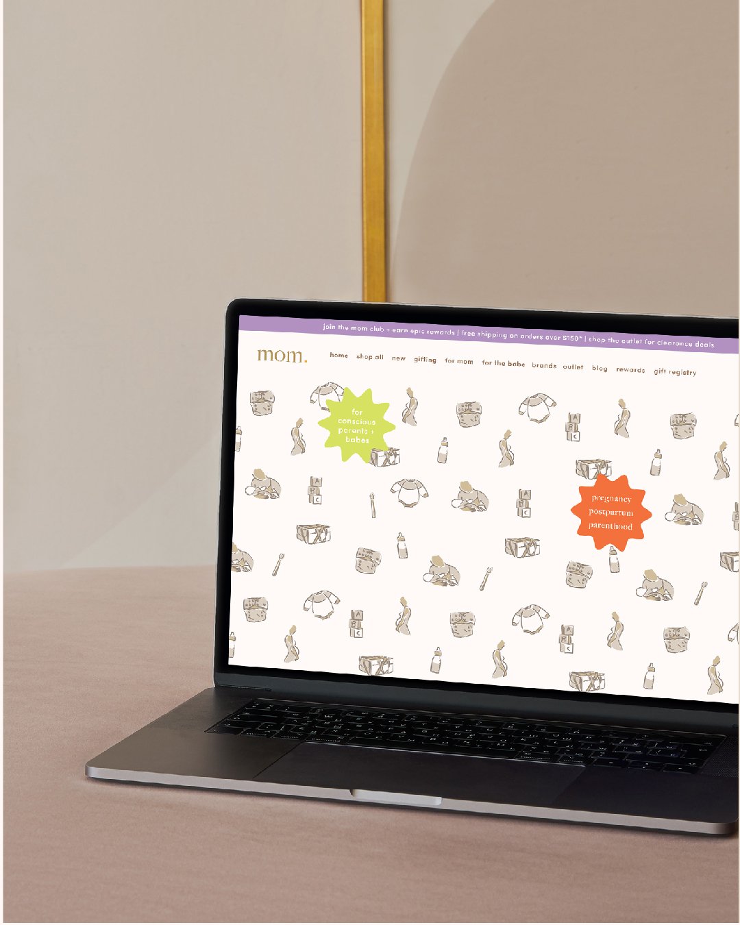
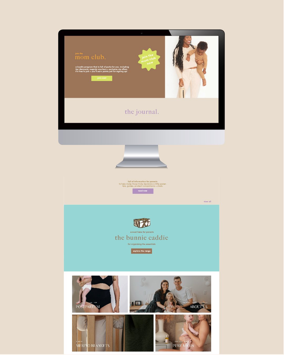
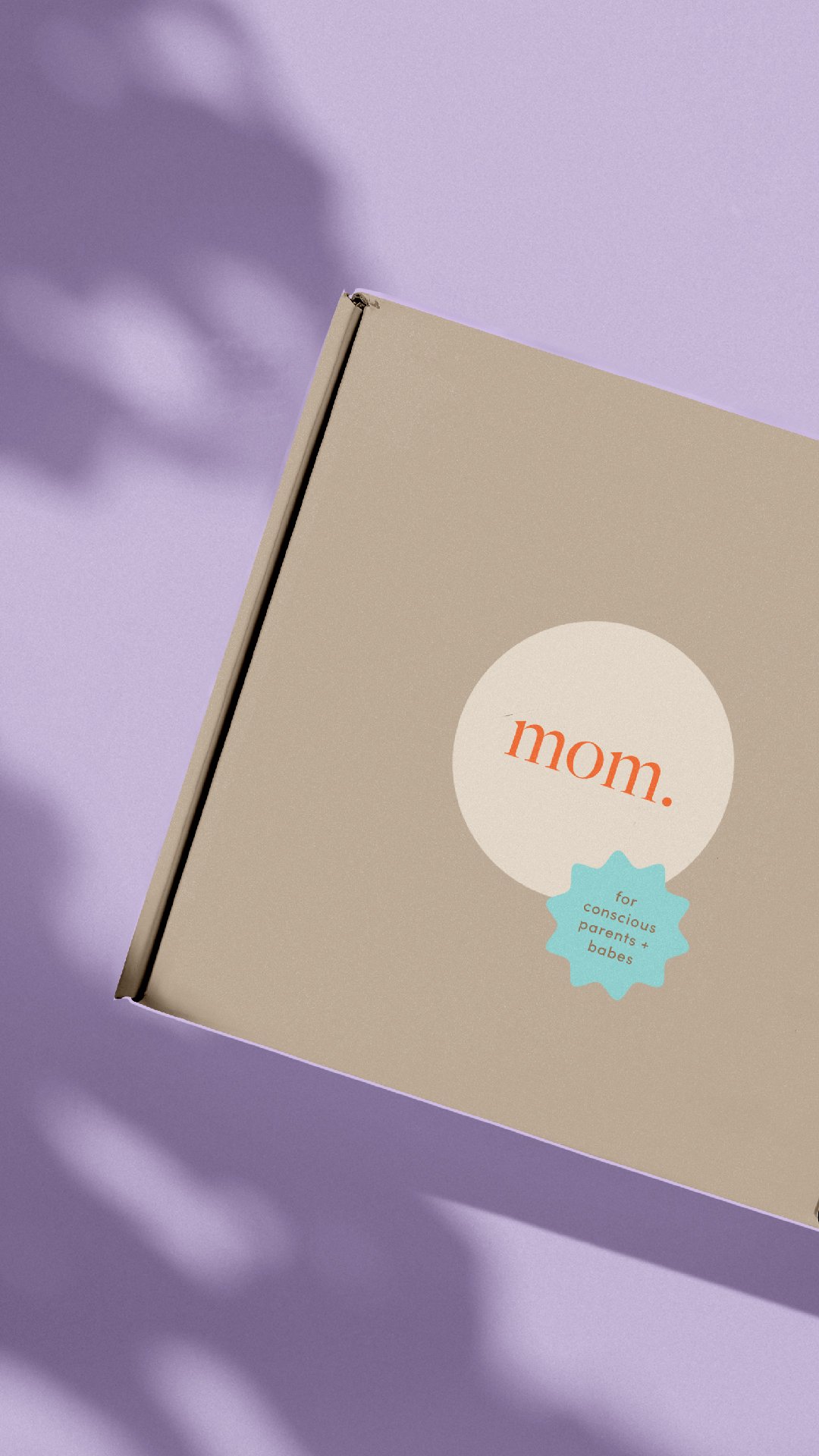
Adding pops of colour was another important part of the brief showcasing the playful element of Mom Store and helps stand out against the competition. Not to mention great for social media, merch and promotions. these are secondary supporting colours with the neutrals still being dominate colours.
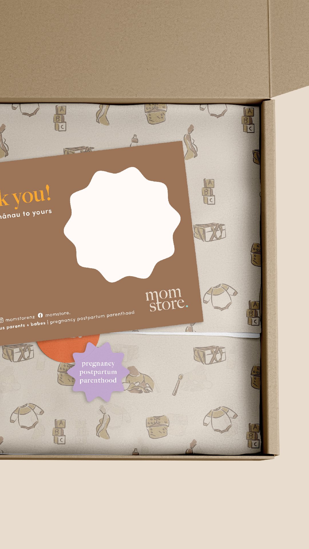
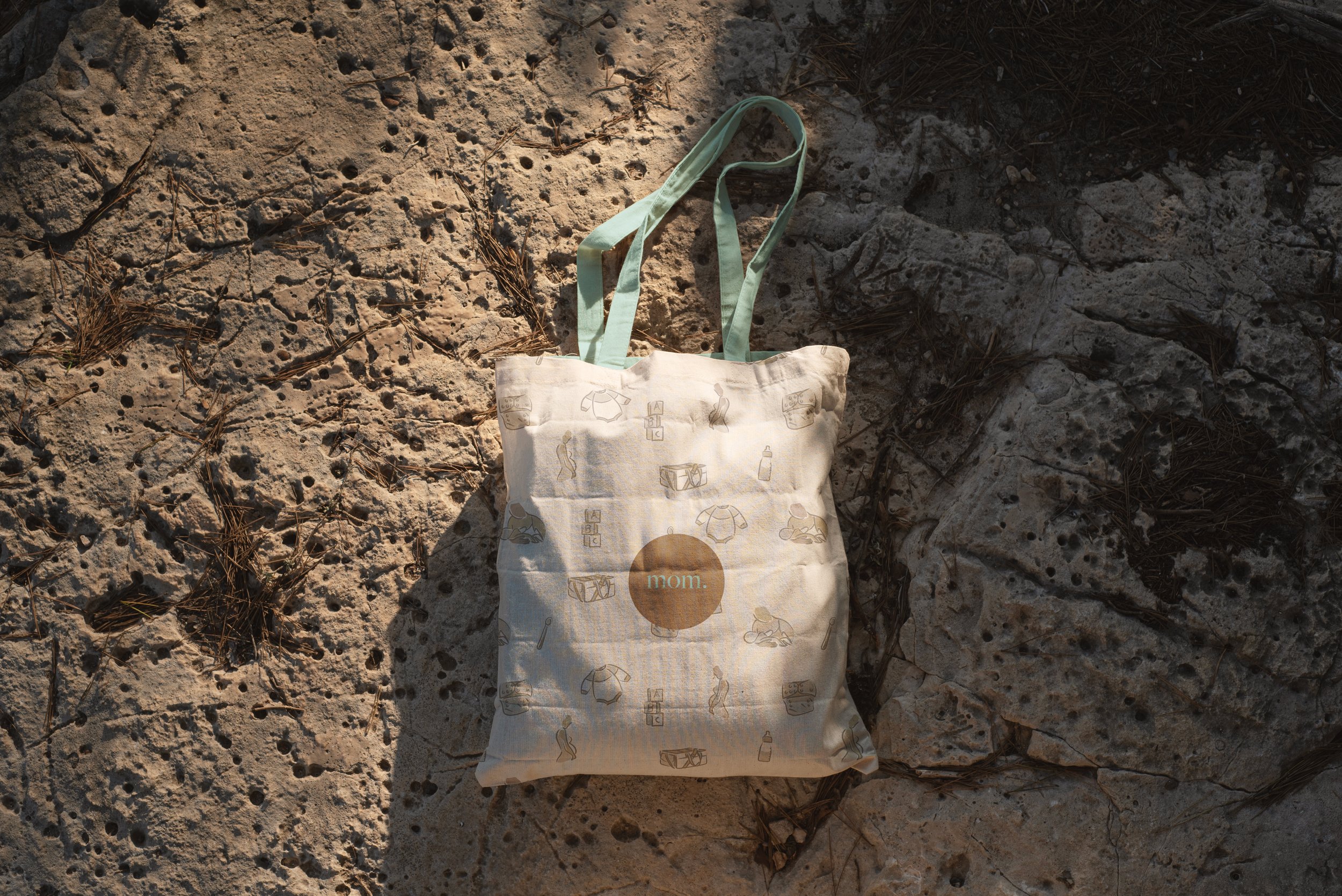
Brand illustrations and print was a highlight to work on. Showcasing areas and products Mom Store stock and add the personality to the brand again captivating the customer and standing out in the crowd.